-
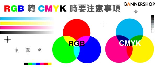
What do you need to pay attention when you prepare the artwork files before printing? In addition to checking if the text is outlined, images is embedded, or bleeding, "color" (RGB vs CMYK) is also important.
Not everyone knows the difference between RGB and CMYK color modes, especially if you’re not a graphic designer or printer. What RGB and CMYK stand for is the easy part, why it’s crucial to be aware of the difference is much more important.
-

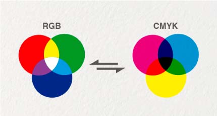
The RGB color mode is Red, Green, and Blue light added together in various ways to reproduce a broad array of colors. RGB color is mainly used for television, computer, and other electrical displays. CMYK is a term used by graphic designers and printers for “full color”. The CMYK color mode is Cyan, Magenta, Yellow, and Black ink used together in printing multiple colors. K stands for “key” and is Black. Since B is already used in RGB for Blue, K for key makes sense since printing plates are carefully keyed with the Black. Some say it’s because K is also the last letter in Black.
-
※ Tips for Converting RGB to CMYK ※
In view of the above problems, there are a few tips to recommend to you before printing. Of course, you have to know that the printed product is different from the computer screen color.
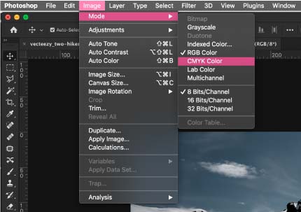
1. Design the colors before starting the design: Regardless of whether you are using any design software, you must first convert the design colors to CMYK instead of RGB.
2. Flattened pictures: Since the pictures are all RGB, flattened files can ensure that the color settings of the entire image are consistent.
3.Avoid using picture effects and transparency: There are many designs that like to use special effects such as layer, transparency, etc., because the superimposed effects of the effects will change the color value. But some effects are only seen on the computer, but printed out is not obvious. For example, the shading effect can be clearly seen on the computer but will have no effect when the color values are too close. Transparency will also have the opportunity to make the color value different and produce a large color difference.
-
If you, or a web designer, are creating a website it will have to be in RGB color mode. The RGB color spectrum is larger than CMYK, and what you see is what you get. Keep in mind that color display configurations vary, and colors may look different on different displays. Now, where things get tricky is viewing art on your device that you intend to print. If the design is setup in RGB mode it will not be what you see is what you get when printed. See the two photos below. You will notice the RGB image on the left is more vibrant, especially the blue. The CMYK image on the right looks more washed out. If you just send the image on the left to print without making the proper adjustments, you will most like not be happy with the printed result.
It is difficult to match the colors you see on a computer screen or mobile device to a printed product. Designing in RGB is fine, and sometimes used more often since in programs such as Adobe Photoshop you can do more with filters. You must remember though to change the color mode from RGB to CMYK before sending the job in for printing. This will also give you a chance to get more of an idea of which colors look poor and time to adjust color levels.
If you have any questions, please feel free to contact us or use our designers of Bannershop.
Tips for converting from RGB Mode to CMYK